


10,000+ Happy Brands Worldwide
Product Page Design Services That Drive Conversions
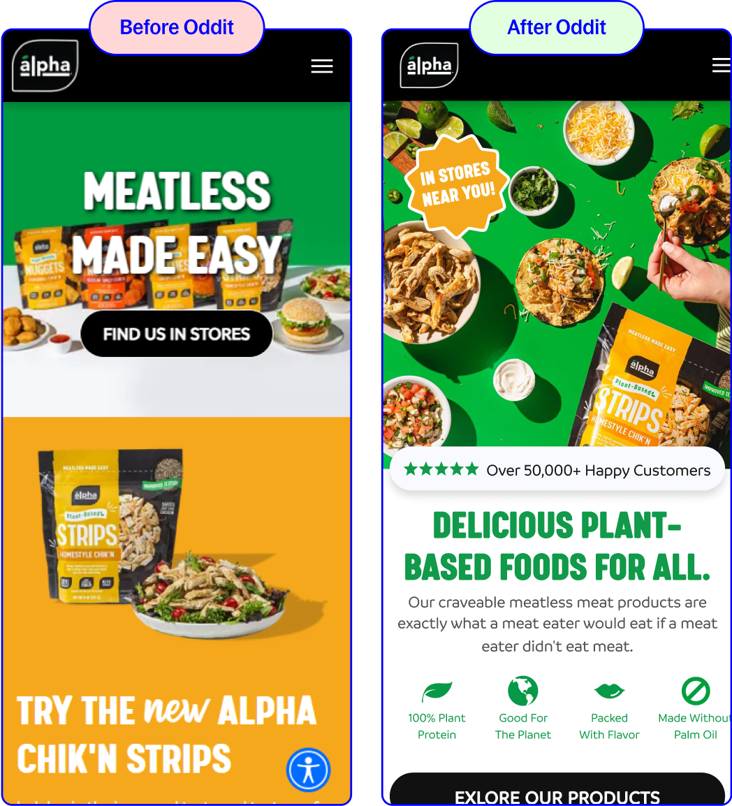
Your product page — or PDP — is where revenue gets made or missed. When shoppers land on a slow, cluttered, or unconvincing product page, they bounce, and every lost session bleeds margin. Oddit delivers conversion-optimized product page design that fixes the friction killing your sales, without the retainer bloat or endless agency meetings.
Heatmap & Session Data Audit
Every redesign starts with how shoppers actually behave on your PDP — not assumptions about what looks good.
Dev-Ready Design
Figma files with component states and developer annotations — battle-tested across Dawn, Impulse, Prestige, and custom Shopify themes.

No Retainers, No Contracts
Fixed-fee delivery in 2–4 weeks. Zero ongoing commitment, only what your product page needs right now.
Most Brands Lose 30–50% of Buyers Right Here
That's not a marketing problem — it's a design and UX problem. When your product page doesn't build trust, clarify value, or guide action, you're burning ad spend and leaving money on the table. Every percentage point of conversion lift compounds: if you're driving 10,000 monthly visitors to a $75 AOV product at 2% conversion, you're leaving $75,000 on the table for every additional point you could gain.
- Weak or generic above-the-fold messaging that doesn't hook attention
- Thin or robotic product descriptions that sound like spec sheets
- Missing or buried social proof, reviews, and trust signals
- Confusing variant selection or unclear CTA hierarchy

Above-the-Fold Messaging
Trust & Social Proof Placement
Variant Selection & CTA Clarity
Mobile Image & Load Speed
Above-the-Fold Messaging
Trust & Social Proof Placement
Variant Selection & CTA Clarity
Mobile Image & Load Speed
Above-the-Fold Messaging
Trust & Social Proof Placement
Variant Selection & CTA Clarity
Mobile Image & Load Speed
Above-the-Fold Messaging
Trust & Social Proof Placement
Variant Selection & CTA Clarity
Mobile Image & Load Speed
The Proven Hierarchy Behind High-Converting Product Pages
High-converting product pages follow a structure that's been validated across thousands of Oddit engagements. Every element has a job. Every section earns its place by moving a hesitant shopper closer to adding to cart.

Above the Fold
Mobile-first visuals and a value prop that lands in under 3 seconds

Fast-loading product imagery that showcases the product from multiple angles
An above-the-fold narrative that answers "why this matters" before a visitor scrolls

Trust & CTA
Trust-building modules and unmissable, unambiguous CTAs
Reviews, UGC, guarantees, and press mentions placed where shoppers naturally scan
Sticky add-to-cart buttons with clear shipping and return policy visibility
Product Page Design & Optimization
Conversion-optimized product page redesign to turn more browsers into buyers — starting with your highest-traffic PDP.


4.96 Average Rating

Order Now & Get It in 2–4 Weeks
Need help with the implementation? We do that too.
Order It For UsIncluded in Every Product Page Redesign!
Custom designed sections to help you spotlight your bestsellers, clarify your value proposition, and optimize your highest-traffic PDP for today's distracted shopper.

Data-Driven Friction Audit

Dev-Ready Figma Files

Copy Edits & Testing Roadmap
Product Page Design Proven to Increase CTC, AOV, and LTV
See More Our WorkAPPAREL


HEALTH & WELLNESS


HEALTH & WELLNESS


APPAREL


What We're Especially Good At
Fixing Above-the-Fold in Seconds, Not Scrolls
Placing Trust Signals Where They Actually Work
Designing for How Phones Actually Shop
Get a Free Product Page Redesign!
Choose any product page on your site. We'll analyze it using our conversion audit framework, identify the section most critical to conversion — typically your product card, reviews block, or image gallery — and deliver a redesigned version with a full before-and-after comparison. No credit card required.
What’s a Section?
A section of a page, comprising several elements (e.g. a hero & a functionality section), or an individual section or revision design — delivered in Figma with full conversion rationale.

Ready to Stop Losing Buyers on Your Product Page?
Get a custom redesign built to spotlight your product, clarify your value proposition, and turn more browsers into buyers.


Collapsible content
Can Oddit work with my Shopify theme or builder?
Yes. Our Figma deliverables work with any Shopify theme, page builder, or custom stack. We've had thousands of developers implement Oddit designs across Dawn, Impulse, Prestige, and fully custom themes.
What's the difference between "product page" and "PDP"?
Nothing — PDP stands for Product Detail Page, and it's the same thing as your product page. Some teams use one term, some use the other. We use them interchangeably throughout our process and deliverables.
How is this different from a full ecommerce CRO audit?
This service focuses specifically on your product page — the single highest-leverage page on most ecommerce sites. If you want a broader audit across your homepage, cart, and checkout as well, our full Ecommerce CRO Audit covers that wider scope.
Can I try this before committing to a full redesign?
Yes. Start with a free redesigned section — choose any product page, and we'll identify the highest-impact friction point and deliver a before-and-after comparison with implementation notes, 100% free, no credit card required.