
collections-page-guide-part-2
min read


Get a taste of the Oddit experience with 1X free redesigned section from any page of your website or product.


The Homepage Header Guide - Part 1
With the price of paid media and overall marketing costs rising, it's never been more important to optimize your website experience to convert browsers into buyers.
We're diving deep into 5 brands and how we adjusted their mobile homepage! You can test ALL these suggestions on your own website.
Let's jump in!
Number 1: Hux

We’re always talking about homepage headers, but why not? It’s your front entry, your store greeter, your street signage – your first impression.
1. Always make sure actions are clearly actions, and ensure they have enough space to accidental clicks. The brag bar here calls out an offer if you ‘sign-up’ – but where’s the action? A simple underline is all you need.
2. Building a brand is all about building trust with your customers. The simplest way to build trust is social proof. This can be in the form of positive reviews callout, a press quote, total subscribers or customers – anything that says, “others have tried this, and they f**king love it.”
3. Never has the adage been more relevant than right here: A picture is worth a thousand words. Especially when your headline and your brand name don’t tell users what you make, show them! A well-lit, hero shot of your product can be the difference between a sale and a see-ya-later.
4. The only thing that should be between your headline and your sub-heading is space. By separating your 1-2 punch, you’re taking away its power.
5. Use your actions/buttons as communication points. Always assume the user has scanned right past certain pieces of key information, and call out exactly what you make on this button!
Number 2: Puzzledly

We love color, but when you’re using it in large amounts it’s important to find balance.
1. Separate large blocks of color with white or black negative space so they aren’t a visual overload for the user. If the overall aesthetic is complex and hard on the eyes, it’s likely not going to get communicated (i.e. they aren’t going to read it)
2. Colorful, vibrant product imagery can be powerful, but don’t let users miss out on the packaging. In this case, the packaging provides a nice minimalist color balance to a very ornate puzzle. Showing the puzzle with the box tells a more clear brand story.
3. Don’t use 300px of screen height to explain something you can do in 1 line. Utilizing large amounts of color means simplifying everything else where you can (Find your brand Chi!)
4. The key to finding balance is building a content hierarchy that drives action. Keep it simple and to the point. Beautiful image, clear headline, simple & accessible action.
5. Make user engagement easy by ensuring your key actions are full width on mobile, and sit at the bottom of the fold. If action buttons are short and in the middle, or too far to the left/right, they can be difficult to reach on mobile devices.
Number 3: Magic Spoon

New customers discover your brand every day – make sure you’re telling them what you do, why it’s great and give them easy access to cop it.
1.Treat your mobile navigation like an art gallery by only showing the goods (primary actions). Account/login is a secondary action – move it inside the mobile menu so it’s easy to access, but not taking attention away from your cart and mobile menu button.
2. Beautiful, art directed images and animations are awesome, but in this case the cereal itself isn’t necessarily visually stunning (or communicating much). Back it up with a nice simple line highlighting the key features of the product shown.
3. Use your button as an opportunity to communicate more about your brand! Users like to scan – the more you can tell them in key areas the better. “Try Now” is fine, but “Shop All 6 Flavors” tells them a lot more.
As well, make sure it sits in the bottom 20% of the screen and is full-width for easy accessibility.
Number 4: Once Upon A Farm
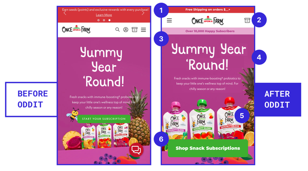
1.Carousels are a bad experience in every scenario, including your brag bar. Choose 1-2 key things you want to communicate with users, and feature them simply.
2. Your nav should be responsive just like the rest of your site. Decide what is absolutely critical for users to access outside of the mobile menu, and place it in the nav. General rule of thumb is logo (home), menu, and cart – anything else better have a good reason to be there.
3. Never assume you don’t have to prove yourself to customers by showing social proof. No matter how big you are, there’s always new customers discovering you. Let them shop with confidence by calling out reviews, or total customers/subscribers for instance.
4. If you ever have 1 word per line in a heading (unless you’re designing a billboard), you’ve done something wrong. Start again. On mobile, always be mindful of (1) how easy text is to scan and (2) how much vertical space it’s taking up.
5. You’re selling products, not whitespace. Make sure your packaging/product is clearly shown, and ensure it’s the centerpiece of your display. Treat your product image like the hero in a movie poster.
6. We say this nearly every thread, but it’s a problem on every site so we’re saying it again. Make actions on mobile (1) full-width for accessibility (2) as close to the bottom of the fold as possible (3) and use them as a communication point.
Number 5: ChopFit

The best products are easy to describe because they are simple – but copywriting can only go so far.
Always make sure your product is visualized in an engaging and easy to access manner.
1. Especially when your product is something users may not have seen before, surface some form of social proof (such as reviews or # sold). This tells customers “we know this is foreign to you, but look at all these other amazing people that trusted us and love it”.
2. Separate your copy from your image or video. By overlaying them, they both lose their punch. The updated image can still be a video/gif, just needs to be easy to see the ACTUAL product.
3. If you’ve got the whitespace, pull in some key traits or benefits of the product in a punchy, simple manner. Not everyone is used to working out with a fake axe – tell them what’s gettin’ ripped!
4. Ask yourself: Is your subheading truly adding value? Is there any lost communication if you remove it? Unless it’s a resounding yes, delete. Simplify to a simple heading that is easy to scan (especially now that we’re calling out key traits on the image!)
5. We love bottom floating menus (it’s the future!) but let users focus at the beginning. Trigger this menu to pop-in once they scroll so your beautiful new (and engaging) header conversion isn’t crushed by overlapping actions.
Want us to look at your website? Grab a FREE Oddit or book a call to chat with our team!

Lorem, ipsum dolor sit amet consectetur adipisicing elit. Eius, temporibus, aut officia minus sequi quae molestias beatae, qui ipsa mollitia alias accusamus voluptate ratione provident numquam iure quia aliquam tempore possimus consequatur vel. Iure atque enim in? Magnam quis cupiditate quia labore quaerat, eligendi nobis, ab similique harum nostrum nulla aliquam dolore adipisci ut. Eaque doloremque iure veniam nobis asperiores!
Lorem, ipsum dolor sit amet consectetur adipisicing elit. Eius, temporibus, aut officia minus sequi quae molestias beatae, qui ipsa mollitia alias accusamus voluptate ratione provident numquam iure quia aliquam tempore possimus consequatur vel.
Lorem, ipsum dolor sit amet consectetur adipisicing elit. Eius, temporibus, aut officia minus sequi quae molestias beatae, qui ipsa mollitia alias accusamus voluptate ratione provident numquam iure quia aliquam tempore possimus consequatur vel.
“Lorem, ipsum dolor sit amet consectetur adipisicing elit. Eius, temporibus, aut officia minus sequi quae molestias beatae, qui ipsa mollitia alias accusamus voluptate ratione provident numquam iure quia aliquam tempore possimus consequatur vel.”
Lorem, ipsum dolor sit amet consectetur adipisicing elit. Eius, temporibus, aut officia minus sequi quae molestias beatae, qui ipsa mollitia alias accusamus voluptate ratione provident numquam iure quia aliquam tempore possimus consequatur vel.
Iure atque enim in? Magnam quis cupiditate quia labore quaerat, eligendi nobis, ab similique harum nostrum nulla aliquam dolore adipisci ut. Eaque doloremque iure veniam nobis asperiores!

This is a small caption
Lorem, ipsum dolor sit amet consectetur adipisicing elit. Eius, temporibus, aut officia minus sequi quae molestias beatae, qui ipsa mollitia alias accusamus voluptate ratione provident numquam iure quia aliquam tempore possimus consequatur vel.
Iure atque enim in? Magnam quis cupiditate quia labore quaerat, eligendi nobis, ab similique harum nostrum nulla aliquam dolore adipisci ut. Eaque doloremque iure veniam nobis asperiores!
This is a small caption
Lorem, ipsum dolor sit amet consectetur adipisicing elit. Eius, temporibus, aut officia minus sequi quae molestias beatae, qui ipsa mollitia alias accusamus voluptate ratione provident numquam iure quia aliquam tempore possimus consequatur vel. Iure atque enim in? Magnam quis cupiditate quia labore quaerat, eligendi nobis, ab similique harum nostrum nulla aliquam dolore adipisci ut. Eaque doloremque iure veniam nobis asperiores!
Lorem, ipsum dolor sit amet consectetur adipisicing elit. Eius, temporibus, aut officia minus sequi quae molestias beatae, qui ipsa mollitia alias accusamus voluptate ratione provident numquam iure quia aliquam tempore possimus consequatur vel.
Lorem, ipsum dolor sit amet consectetur adipisicing elit. Eius, temporibus, aut officia minus sequi quae molestias beatae, qui ipsa mollitia alias accusamus voluptate ratione provident numquam iure quia aliquam tempore possimus consequatur vel.
“Lorem, ipsum dolor sit amet consectetur adipisicing elit. Eius, temporibus, aut officia minus sequi quae molestias beatae, qui ipsa mollitia alias accusamus voluptate ratione provident numquam iure quia aliquam tempore possimus consequatur vel.”
Lorem, ipsum dolor sit amet consectetur adipisicing elit. Eius, temporibus, aut officia minus sequi quae molestias beatae, qui ipsa mollitia alias accusamus voluptate ratione provident numquam iure quia aliquam tempore possimus consequatur vel.
Iure atque enim in? Magnam quis cupiditate quia labore quaerat, eligendi nobis, ab similique harum nostrum nulla aliquam dolore adipisci ut. Eaque doloremque iure veniam nobis asperiores!
This is a small caption
Lorem, ipsum dolor sit amet consectetur adipisicing elit. Eius, temporibus, aut officia minus sequi quae molestias beatae, qui ipsa mollitia alias accusamus voluptate ratione provident numquam iure quia aliquam tempore possimus consequatur vel.


Not sure where to start? Book a Discovery Call


