

Homepage Header Guide - Part 2

FREE CONVERSION TIPS
Book a 30-Minute Teardown Call
Get answers to questions like:
Welcome to part 2 of The Homepage Header guide!
We're diving deep into 5 brands and how we adjusted their mobile homepage! You can test ALL these suggestions on your own website.
Let's jump in!
Number 1: Hint

Offers are a great way to drive action, but only if they're easy to digest.
6 changes we made:
Suggestion 1: Use your announcement bar to call out a specific offer and use it to drive action. Suggestion 2: Bigger doesn’t always mean more impactful – your logo needs breathing room so it can pop and be easier to see!
Suggestion 2: Bigger doesn’t always mean more impactful – your logo needs breathing room so it can pop and be easier to see!
Suggestion 3: Remove carousel – it’s distracting and not adding value to the header. Select a single feature and communicate it clearly – we suggest the amazing first customer offer.
Suggestion 4: When your packaging is vibrant and beautiful make it a key element of the header. By finding balance between your image size and volume of copy, you are also helping limit the amount of text you can use (to avoid situations like this)
Suggestion 5: Make user engagement easy by ensuring key action buttons are full width on mobile, and sit at the bottom of the fold. If action buttons are short and in the middle, or too far to the left/right, they can be difficult to reach on mobile devices.
Suggestion 6: Call out your shipping offer directly below the action button.
Number 2: Arrived
 Quick Tip: Whether you're a DTC, B2B, or SaaS brand, every website needs social proof. For this real estate investment site we used properties funded, registered investors, and property value funded as social proof points
Number 3: FlowFi
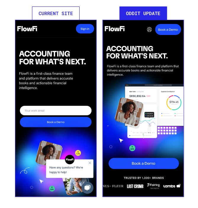
Quick Tip: Don't waste valuable space on a "Sign In" button. Instead, test inserting an action that drives new users and make "Sign In" secondary
Number 4: Kanga

Provide users with ALL the information they need to make a quick decision.
Suggestion 1: Tighten up the navigation padding/spacing. There’s no reason for it to be taking up so much vertical space.
Suggestion 2: Tighten up the image crop, and the image and text in a way that makes the copy easier to read.
Suggestion 3: Don’t forget to tell users what you sell and what makes it great.
Suggestion 4: Make sure the call to action is full-width, easy to read, and placed at the bottom of the first fold where it is most accessible. As well, be descriptive on it — if users skipped the content above it, they still know where they are going!
Number 5: Fathead

Quick Tip: Pretend a user doesn't read your headline - just from your call-to-action button will they know where they're going? Be descriptive with buttons.
Want us to look at your website? Grab a FREE Oddit!

Shaun Brandt

Try Oddit Free
How It Works
-
 Choose a page on your site where traffic is being driven.
-
Our team redesigns and optimizes one key section from the page.
-
We send you the designs and a mini report explaining the changes within 2 business days.
view a sample


What’s a Section?
Think of a section like a slice of a page, containing specific content & functionality–like a product card or reviews section.


Book a 30-Minute Teardown
Got a webpage that you’re stuck on? Book a 30-minutes with a member of our leadership team and get an expert, fresh perspective to help you move forward.

"Fire your agency today. Hire Oddit tomorrow.”
“I only trust Oddit to make design changes to my site.”
"Fire your agency today. Hire Oddit tomorrow.”
“I only trust Oddit to make design changes to my site.”
"Fire your agency today. Hire Oddit tomorrow.”
“I only trust Oddit to make design changes to my site.”
"Fire your agency today. Hire Oddit tomorrow.”
“I only trust Oddit to make design changes to my site.”
"Fire your agency today. Hire Oddit tomorrow.”
“I only trust Oddit to make design changes to my site.”
"Fire your agency today. Hire Oddit tomorrow.”
“I only trust Oddit to make design changes to my site.”
"Fire your agency today. Hire Oddit tomorrow.”
“I only trust Oddit to make design changes to my site.”
"Fire your agency today. Hire Oddit tomorrow.”
“I only trust Oddit to make design changes to my site.”
"Fire your agency today. Hire Oddit tomorrow.”
“I only trust Oddit to make design changes to my site.”
"Fire your agency today. Hire Oddit tomorrow.”
“I only trust Oddit to make design changes to my site.”